
Devlog #27: The Codex
Hello friends! We’re back with another devlog for Automation Station. This one is all about the Codex, which will act as a reference manual for all of the items, buildings, and everything else you’ll discover in this strange world. There is a lot to talk about, from the design to implementation, so let’s dive in!
Why add a Codex?
Before implementing a big new feature like the Codex, it is important to understand why it’s necessary and what problems or use cases it addresses. A lot of games have a codex-like feature containing various tidbits of information, but personally, I rarely look at them or don’t even know they exist. In those games, the codex is supplementary, providing a bunch of information that isn’t that important or aggregating information that can be found elsewhere.
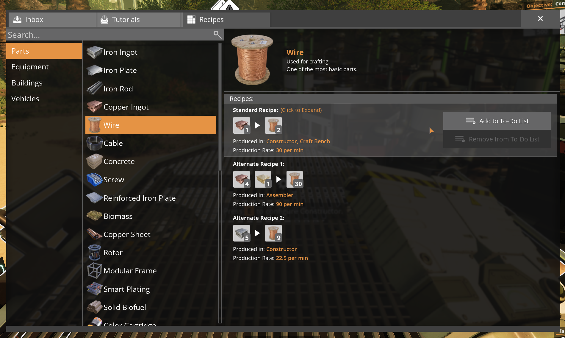
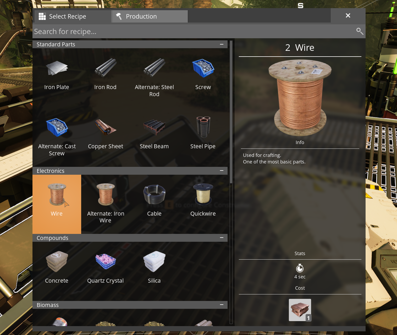
For example, in Satisfactory, all the recipes can be found in the codex. However, each building has a separate UI listing all of its recipes, and this is usually the first place I’ll look for this information.
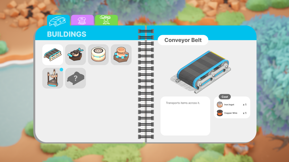
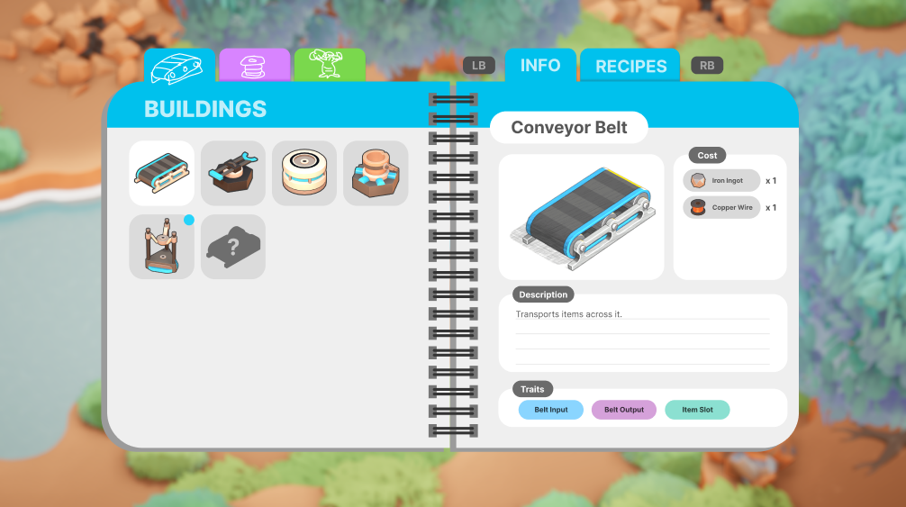
In Automation Station, buildings don’t have UI screens. That means all of the game’s information has to be communicated to the player in other ways. This is also why buildings don’t have internal inventories and why buildings dynamically set recipes based on what is given to them. However, players will still need a place to check item recipes so that they know how to build their factory. They also need to understand how each building and item is intended to be used or combined with other objects in the game. The Codex aims to fill this gap.
Design Inspiration
When I set out to design the Codex, I didn’t care about making it super unique or novel in any particular way. I just wanted something that communicated all of the important information to the player in an easy-to-use interface. So I started by looking at what other games were doing. I made a big board of images from a bunch of different games and screens within those games.
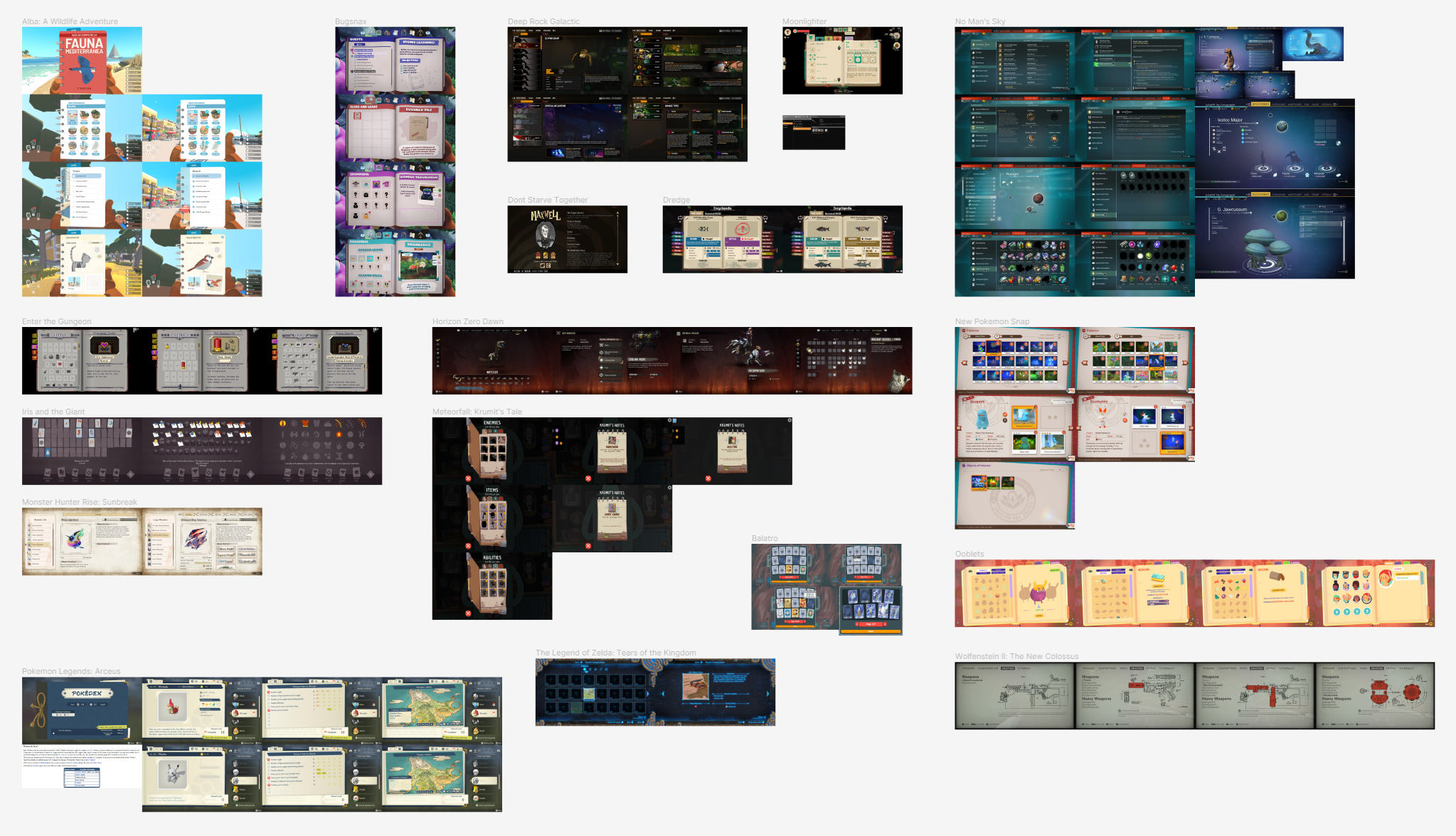
Immediately, I noticed a lot of similar elements across different designs. Almost all of them used a two-panel design where one part of the screen let you select an object and the rest of the screen showed information about the object. No Man’s Sky and Deep Rock Galactic used lists to browse the objects, but the majority (and the ones I liked most) all used a grid format where each cell showed some kind of image or icon for the object. This grid format makes it super easy to pick out the object you want and quickly navigate to it. Once an object is selected, the other part of the screen usually has a big image of the object alongside a bunch of information.
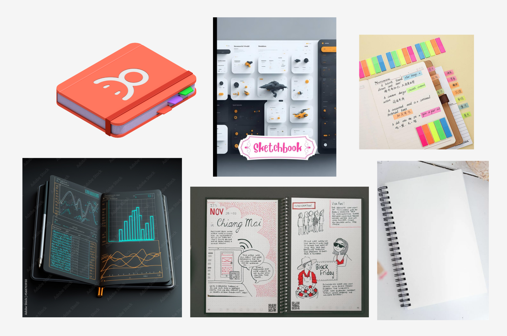
Another common design theme I noticed was how the codex was made to look like a physical notebook where each entry was a different page. I was immediately inspired by this idea and started pulling out various reference images of notebooks that could fit the sci-fi theme of Automation Station. I also got the idea from Snaxalot to take inspiration from school planners that organized information into neat sections.
Sketching it Out
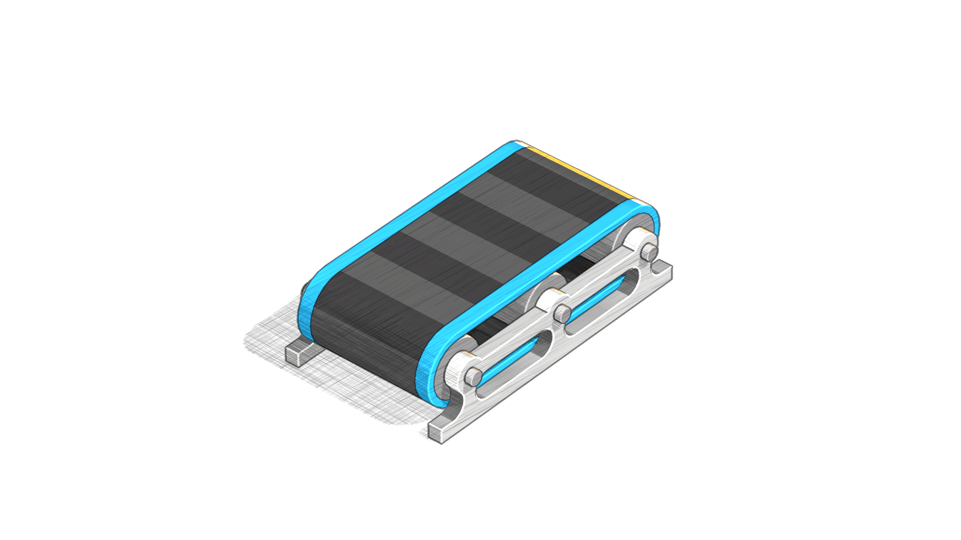
Once I had settled on the notebook/planner design, I started thinking about how the objects should be depicted inside the codex. While the normal rendered icons would work okay, I thought it would be fun to try out some shader effects to make the objects look like they had been sketched by (robot) hand.
I had vaguely remembered someone on Twitter posting about some cool hatching shaders they created. After digging through my bookmarked tweets, I was pleasantly surprised to find that the author, Christopher Sims, had shared the code on GitHub and even made several different versions for different Unity render pipelines.
Based on Christopher’s incredible work, I was able to merge the hatched shading effect with my cavity shaders to come up with a sketch shader I was super happy with. Here is how it looks:
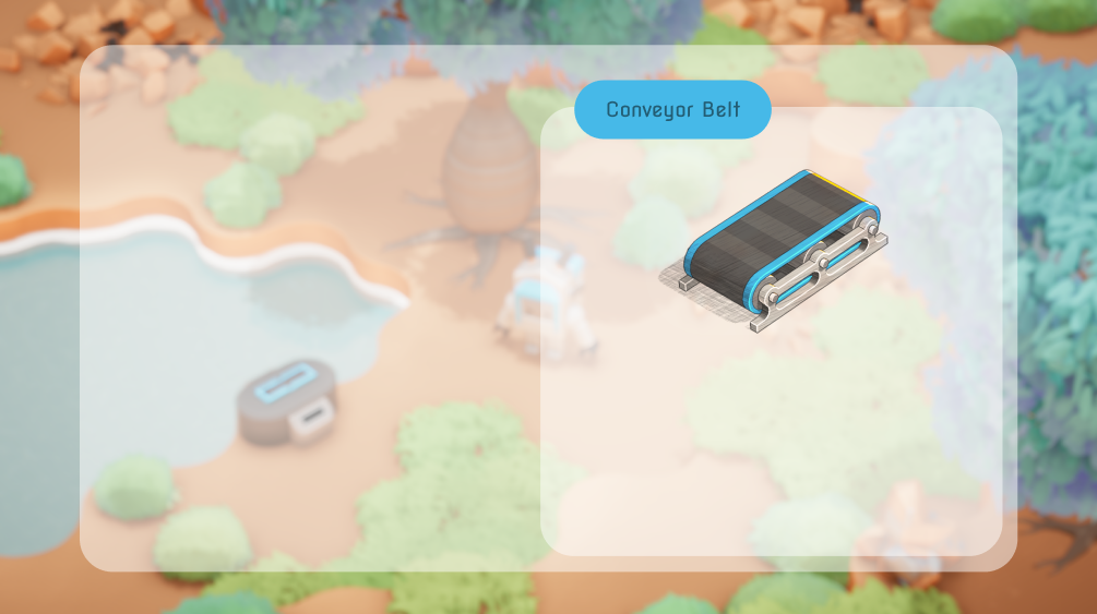
The shader also works in 3D and in real-time with parameters to control different parts of the effect, as seen here:
Evolving the Design
With the sketch shader done, I got to work on the design of the interface itself. My first attempt was actually before I had decided on the notebook look. I was trying to be consistent with the semi-transparent rounded panels used for the rest of the game, but it wasn’t really working here. By the second draft, I added the spiral ring, which really helped sell the notebook aesthetic. The final iterations were mostly just experimenting with colors and layout to make something visually appealing.
One of the design questions I grappled with was how the category tabs should look on the top left of the codex. I experimented with both text and icons (placeholder in the mock-up) and ultimately decided that the improved readability of the text was the better option.
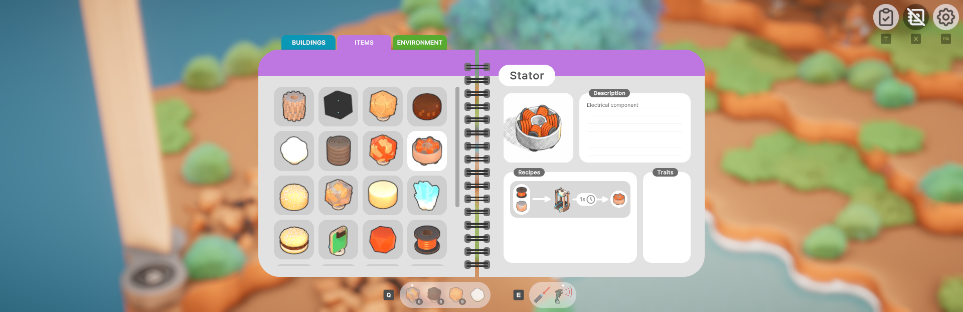
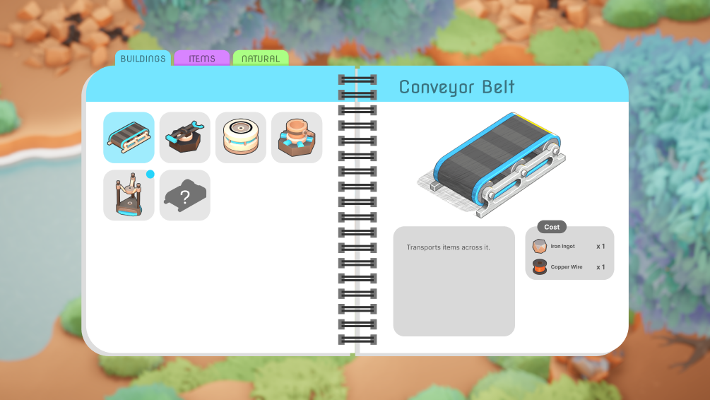
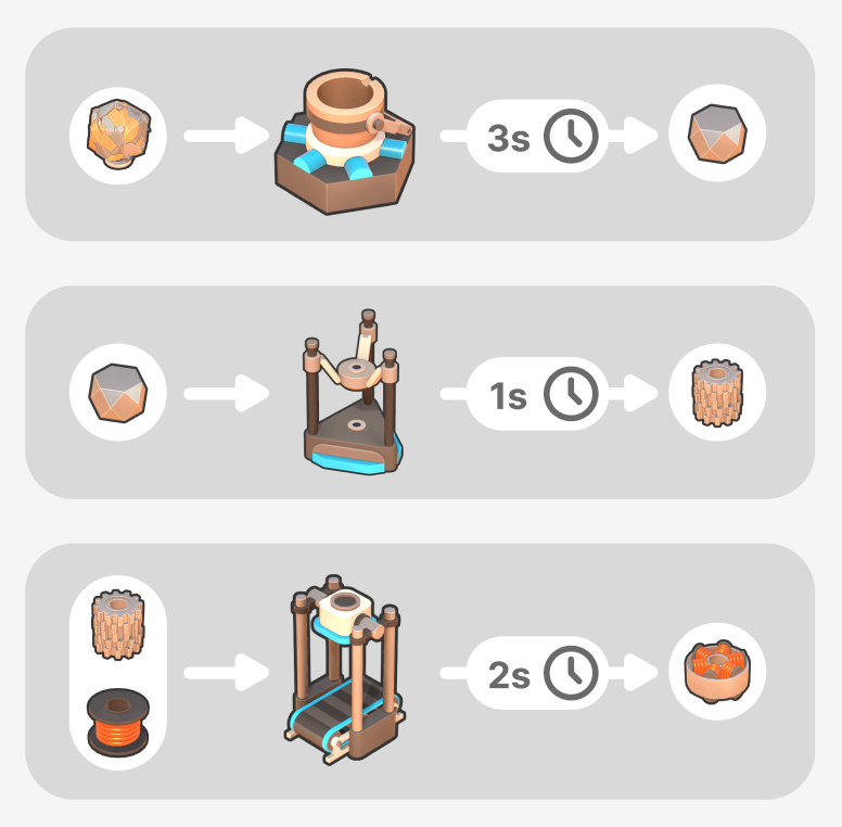
As I mentioned above, one important feature of the codex is to display recipes. Players should be able to see what buildings they need to use to craft an item and all of its required ingredients. Here is the mock-up for different kinds of crafting and smelting recipes:
Implementing the Codex
After wrapping up the designs and mock-ups, it was time to get the codex working in-game. As I’ve said many times before, user interfaces take a long time to implement. Even with a mostly finished design as a reference, creating all of the individual UI elements and wiring up all the functionality takes a lot of work. It took over a week to recreate the design in Unity and even longer to wire up all the data and adjust various style settings and colors to my liking. Once that was all done, I was finally able to see how it felt in-game. Here is the result:
There is still some work left to do in a few places, but I’m really happy with how the codex turned out. I expect that it will continue to evolve throughout the game’s development, but it should be easy to tweak and extend now that the groundwork is done.
New Controls… Again
I’ve mentioned several changes to the controls in previous devlogs, and this one is no exception. The truth is, the controls have never felt perfect, so we are always thinking about ways to improve them. Some of you might be wondering why we are spending so much time on the controls when we could just implement control rebinding. First off, default keybinds are very important to get right to prevent players from bouncing off the game immediately. Second, design questions like “should pressing this control repeatedly have an effect?” or “is this too many key presses and clicks to smelt an ingot?” influence user input behavior beyond what key those actions are bound to. For example, the presence of an item/tool toggle fundamentally changes how the controls work as well as how the toolbar should look. Whatever design we settle on will definitely support full control rebinding by the time the game is released.
The latest control scheme was suggested by Snaxalot. The basic idea is to remove the item/tool mode toggle introduced in devlog #25 and instead make Q a dedicated item button and E a dedicated tool button (when playing on mouse and keyboard). Right-click will be reserved for unequipping the currently equipped item or tool.
Implementing this control scheme was pretty simple, but the toolbar had to be redesigned slightly to show the new prompts in the right places. We took this opportunity to also fix a pain point with the old design. Previously, if a tool was equipped, only the last used item would be visible in the toolbar. And if an item was equipped, only the last used tool was visible. While this clearly communicated which item or tool was last used, it made it hard to see what other items or tools you had collected.
The new toolbar design keeps both the items and tools in your inventory visible at all times. The last used item or tool now has a little white dot above it to help differentiate it, although this might need to be made a bit more obvious.
Here is how the new toolbar looks in-game:
The last piece of the new controls that we’re still figuring out is what Q should do when an item is already equipped, or E if a tool is already equipped. Unequipping, cycling to the next, or doing nothing all seem like viable options. I’ve gone ahead and implemented all three control scheme variants so that we can playtest each before deciding on the default behavior.
Let There Be Dust!
After spending so much time on UI stuff, I decided to spend a morning adding some dust particles to the air. This is a pretty simple VFX technique that adds a lot to the overall atmosphere of the game. I’m not sure how well you’ll be able to see it in the gif, but here is how it looks in-game:
Wrap Up
Overall, I’m really happy with the current state of the game. The codex ended up being a lot more work than I anticipated, but I think it all paid off in the end. I’m optimistic about the latest controls, and I even managed to fix a bunch of bugs over the last few weeks. However, the combination of the codex, mission tech tree, and toolbar has me feeling a bit burned out on UI work, so I’m super excited to start work on some non-UI features. Snaxalot has been making great progress on some additional features, but I’ll let him share more on all that in a future devlog.
That’s all for this one, folks! Thanks for reading to the end! If you have any feedback or suggestions, let us know on Discord or in the comments below.
Cheers! -Scott
Changelog:
- Created a sketch shader effect
- Designed codex UI visuals and layout
- Built the in-game UI elements for the codex
- Added building costs to building entries in codex
- Dynamically populated the left-hand side of the codex with all objects in the game
- Added hover and selection styling when an object on the left-hand side is interacted with
- Added UI shortcut to the main screen to access the codex (can also press X)
- Reworked icon generation pipeline to support material overrides
- Generated sketch icons for all buildings, items, and environment objects
- Added better cropping support to icon generation
- Added support for per-object zoom controls in icon generation
- Designed recipe visualization for the item entries in the codex
- Dynamically populated recipes (assembler, fabricator, and crucible) when viewing an item in the codex
- Added custom sketch shaders for trees, bushes, and quartz that needed special handling
- Items in building costs in codex entries can now be clicked to jump to the item entry
- Items and buildings in codex recipes can now be clicked to jump to the item or building entry
- Added control prompt to view codex for hovered object
- Disabled dragging in drag views (in both mission browser and codex) when content already fits in the container
- Removed auto-equipping of laser on game start
- Extracting blubber from a blubber tree now makes the middle of the trunk glow instead of the roots
- Improved auto pickup to remember when items spawned close to the player even if the item's pickup cooldown hasn't expired yet
- Stored active item or tool when entering build mode
- Fixed the ESC button to close the mission browser and codex if open
- Removed decrypter, caches, and locks from world generation
- Removed explosion force when destroying rocks. This was causing weird and inconsistent player movement.
- Fixed cursor hovering the edges of ore nodes
- New event system that can handle events with different sizes of payloads
- Migrated to new event system for mission browser
- Added 3 new control schemes that change how items and tools are equipped and switched between
- Redesigned the toolbar to be compatible with the new control schemes
- Fixed system ordering bug for crucible systems
- Fixed errors when item throw gizmos were destroyed
- Added support for swapping or replacing an item in a slot
- Fixed item swapping so that it picks up an entire stack rather than just the top item
- Prevented entering build mode until a building is unlocked
- When items are being spawned or consumed, allowed the shader color to be overridden depending on the use case.
- Used new colors when coal is being consumed in burner, buildings are demolished, and mined items are spawned
- Fixed bug preventing the assembler from receiving items via the belt input
- Fixed order of recipe ingredients in codex
- Fixed vertical alignment of throw gizmo when aiming at a stacker
- Fixed launcher gizmos when aiming at a stacker
- Added support for scroll wheel cycling in build mode
- Extracting resources with the laser now uses specific hard-coded spawn positions. This prevents weird physics bugs where items can go flying off the map.
- Improved laser collision on blubber trees
- Improved hover logic with mouse and keyboard in play mode
- Allowed launchers to launch stacks of items
- Fixed belt gizmos for stacker
- Updated build mode validity system to set more specific warning messages explaining why a build is invalid
- Selecting a building in the build mode toolbar with another building already picked up will now cancel the picked-up building rather than demolish it.
- Added floating dust particles to the air
Leave a comment